MCast Pages & Products
MCast™ is the name that represents the entire family of Marquette Energy Analytics software-as-a-service (SaaS) forecasting products. This software family includes
- MCast GasDay, our daily gas demand forecasting product, forecasting out 8 days.
- This product comes with the accompanying Performance Page, a suite of analytics tools designed to make assessing your GasDay model performance as easy as possible.
- MCast GasHour, our hourly gas demand forecasting product, forecasting out up to 360 hours (or, 15 days).
- This product comes with the accompanying Hourly Performance Page, a suite of analytics tools designed to make assessing your GasHour model performance as easy as possible.
- MCast Power, our hourly electric demand forecasting product, forecasting out up to 360 hours (or, 15 days).
- This product comes with the accompanying Hourly Performance Page, a suite of analytics tools designed to make assessing your Power model performance as easy as possible.
- MCast Planner, our medium-range gas demand forecasting product, forecasting out 365 days and providing a number of probability scenarios for demand in the coming year.
- Weather Station Optimization
If you're looking for information on one of the products listed above, click on the product name to jump to that section of the Help directory!
Other services offered by Marquette Energy Analytics
Over our 20+ years supporting the energy industry, we've produced a wide variety of reports and custom studies for our customers. A list of current offerings and their basic descriptions is below.
- Load Growth and Design Day Analysis: Custom study to produce an extensive report developing forecasts of natural gas demand on the "design day," the theoretically highest-demand day that might occur during a period of extreme cold weather.
- 1-in-N Cold Weather Condition Report: Report of expected 1-in-N years extreme weather conditions, useful to justify conditions for probabilistic expected recurrence of design day conditions.
- Energy Efficiency Program Analysis: Custom study to analyze and measure the effectiveness of energy efficiency programs.
- GasMonth Reports Service: Service providing monthly natural gas demand forecasts.
- GasMonth/GasYear Reports Service: Service providing monthly natural gas demand forecasts for the next 3 years
More product descriptions and company information can be found at MarquetteEnergyAnalytics.com/services.
If you have interest in one of the services listed above, or if you have another problem you'd like to know if we can assist you in solving, reach out to us!
What does it take to start using MCast?
If you're considering trialing or licensing one of our MCast products for the first time, then this section is for you! You can find listed below the necessary requirements for each of our SaaS products.
To begin with MCast GasDay
- Provide our team with the historical demand data for the area(s) you want forecasted.
- Our team will perform a Weather Station Optimization study to determine the ideal station weighting combination(s) for forecasting.
- The weather data will need to be sourced, from either a third party vendor you already have a license with, or through our partner AccuWeather for Business.
- Lastly, you will need to ensure your IT team approves access to the MCast website URL, through which the product will be accessible. The exact URL will be provided by an MEA team member.
Completing these steps will allow you to receive our simplest forecasting model, the "No-Flow" model. Read about all of our model types and their requirements at the link "Ongoing inputs to the models."
An optional (but recommended) next step is to set up data transfer mechanisms into and out of MCast. This will allow you to download data in an automated fashion outside of the website, and it will also allow you to send load data directly into the product, giving us the ability to deliver enhanced forecasting models (such as our "2-day-ago Flow" model, our most used forecasting model, and our "1-day-ago Flow" model, which allows you to run enhanced intraday forecasts).
You have a few options for the data transfer mechanisms, most notably via the MCast API or SFTP flat file transfer. Read more about your data transfer options and how they impact your forecasting options at the link "Generating Demand Forecasts".
To begin with MCast GasHour
- Provide our team with the historical demand data for the area(s) you want forecasted.
- Our team will perform a Weather Station Optimization study to determine the ideal station weighting combination(s) for forecasting.
- The weather data will need to be sourced, from either a third party vendor you already have a license with, or through our partner AccuWeather for Business.
- You will need to be able to send us ongoing hourly load data, via either the MCast API or an SFTP site.
- Read about the format requirements for flat files in the section "Data File Formats"
- Lastly, you will need to ensure your IT team approves access to the MCast website URL, through which the product will be accessible. The exact URL will be provided by an MEA team member.
Note
We do not currently provide an option to receive "No-Flow" models for hourly forecasting. All hourly forecasts require hourly observed load data as an input to run.
To begin with MCast Power
- Provide our team with the historical demand data for the area(s) you want forecasted.
- Our team will perform a Weather Station Optimization study to determine the ideal station weighting combination(s) for forecasting.
- The weather data will need to be sourced, from either a third party vendor you already have a license with, or through our partner AccuWeather for Business.
- You will need to be able to send us ongoing hourly load data, via either the MCast API or an SFTP site.
- Read about the format requirements for flat files in the section "Data File Formats"
- Lastly, you will need to ensure your IT team approves access to the MCast website URL, through which the product will be accessible. The exact URL will be provided by an MEA team member.
Note
We do not currently provide an option to receive "No-Flow" models for hourly forecasting. All hourly forecasts require hourly observed load data as an input to run.
To begin with MCast Planner
- Provide our team with the historical demand data for the area(s) you want forecasted.
- Our team will perform a Weather Station Optimization study to determine the ideal station weighting combination(s) for forecasting.
- For sourcing weather data in Planner, the only option currently available is to source via our partners at AccuWeather for Business. Therefore, AccuWeather licensing for the necessary stations is a fee built into Planner.
- Lastly, you will need to ensure your IT team approves access to the MCast website URL, through which the product will be accessible. The exact URL will be provided by an MEA team member.
Note
If you already license MCast GasDay or GasHour, the setup of Planner is quite simple for those already-licensed areas. Talk to an MEA team member if you'd like to quickly set Planner up using the data we already have!
Features common across all MCast products
The Header
The header at the top of the page appears for all customers licensing MCast from Marquette Energy Analytics.

If you license both Daily and Hourly MCast products, you will see Daily and Hourly as two different buttons in the top left of the header. If you license just one, you will just see a Home button. Clicking any of these buttons will bring you to the latest forecast for the appropriate time horizon of your application
- See also The Daily Page, The Hourly Page

Selecting Daily or Hourly from the header will open a menu where you can select the Dashboard or the Performance page. These performance pages will give you tools to analyze the accuracy of your daily or hourly forecasts. If you only license a single product, the Performance page will show as a separate tab.
- See also The Performance Page
Whenever you have any new notification, a colored alarm indicating severity will appear next to Notifications on the right side of the header. You can click this Notifications button to see details and/or clear the notifications.
- See also Notifications
For a variety of data needs, you can use the Downloads tab on the right side of the header.
- See also The Downloads Tab
To manage preferences, you can go to the Settings tab on the right side of the header.
The Sidebar
If you click on the three horizontal lines in the upper left corner of the header, a side menu will pop out where you can perform several tasks. Depending on your settings, you may see any of the following buttons.
Display difference
Read Only accounts will not see the 3 menu bars in the top left corner of the header because the controls found under that menu all require a User or Admin level account to perform.
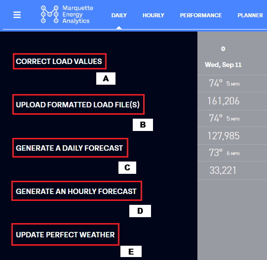
Correct Load Values
What is "Correct Load Values (A)"?
This tool allows you to manually correct any load values uploaded to the SFTP site or the MCast API. Clicking on this feature shows you the current reported load values. You can use the date controller in the upper left to navigate to any date you would like to change.
When you click "Save" after editing values, you will adjust the load value in the database and trigger a forecast to generate. The forecast will run from the first date of a newly edited value through today. For each subsequent forecast, your load files will be read in as normal.
This button will only show up if you are licensing a daily forecasting product.
Locking in Load Values
When the Correct Load Values window is open, you can choose to lock in a load value. By hitting the lock button next to an entry, you will save the corrected values permanently. This will override any value currently in the files uploaded to GasDay and will override any future value read in. Going back into this box and unlocking the value will allow you to start reading in the value from the files once again.
Related docs:
Manually Enter Load Values
What is "Manually Enter Load Values (A)"?
This functionality is available for those who do not have automated data uploads configured through an SFTP site or the MCast API. This feature allows you to manually enter the load for each day in order to generate a forecast.
When you click "Save" after entering a value or values, you will commit the value(s) to the database and trigger a forecast to generate. The forecast will run from the first date of newly entered data through today.
Related docs:
Upload Formatted Load File(s)
What is "Upload Formatted Load File(s) (B)"?
This button allows a user to upload a load file(s) directly to the website.
This will only work if you regularly send MCast load files via SFTP or the MCast API in a pre-approved file format.
This is commonly recommended as a manual workaround if your automated file uploading or your ability to access the SFTP site is failing for some reason.
Related docs:
Generate A Daily Forecast
What is "Generate A Daily Forecast (C)"?
This button will begin the process of generating a new daily forecast. First, our forecasting engine will attempt to retrieve all of the most recent weather and load files, and then it will attempt to generate a forecast.
This button will only show up if you are licensing a daily forecasting product.
Note
New input data is required for a forecast to be generated. If no new load or weather data has been uploaded since the last forecast was generated, then no new forecast will be generated and you will get a duplicate forecast alert.
See also Generating Demand Forecasts
Generate An Hourly Forecast
What is "Generate An Hourly Forecast (D)"?
This button will begin the process of generating a new hourly forecast. First, our forecasting engine will attempt to retrieve all of the most recent weather and load files, and then it will attempt to generate a forecast.
Directly after your hourly forecast completes, the Hourly Perfect Weather Forecasts will begin updating as well.
This button will only show up if you are licensing an hourly forecasting product.
Note
New input data is required for a forecast to be generated. If no new load or weather data has been uploaded since the last forecast was generated, then no new forecast will be generated and you will get a duplicate forecast alert.
See also Generating Demand Forecasts
Update Perfect Weather
What is "Update Perfect Weather (E)"?
This button will begin the process of generating a new daily Perfect Weather forecast. Using the latest load and observed weather data, our forecasting engine will attempt to generate a new Perfect Weather forecast.
This button will only show up if you are licensing a daily forecasting product. Hourly Perfect Weather forecasts do not have a corresponding button because hourly Perfect Weather forecasts are generated immediately after each hourly forecast completes.
Note
Because a Perfect Weather forecast requires a full 24 hours of observed weather data in order to generate new estimates, the latest date that a forecast could generate is the last completed gas day.
Related docs:
The Footer
In the footer of the web page, there are 3 things: the version number of the web code (which links to the release notes), the contact information for our 24/7 product support team, and a button to provide feedback.
Release Notes
Code releases are pushed out to the product on a regular basis to ensure consistent improvement and quick fixes to issues. These code releases leave your access to the product unaffected and are pushed out without notice. If you ever wish to access the public-facing notes of these releases, you can click on the version number in the bottom left corner of the page.
When there is an update that we think may be of customer interest, a text bubble will appear in the bottom left of the page to indicate new features have been added and that details are in the Release Notes.
Contact Information
Our product support team actively monitors customer requests for support via email and phone. Reaching out to this team is the quickest way to get assistance with your product. To contact this team directly, call 414-404-9884 or email Support@MarquetteEnergyAnalytics.com.
Provide feedback
If there is any feedback about the web page that you wish to pass on to our product development team, the button in the bottom right corner of the page opens a form where you can enter feedback directly. All entries on this form get sent to our product development team immediately upon submission.
The Daily Page
The Daily page is designed to display the overview of a single daily forecast at a time.
The main view of the Daily page contains a summary table. The leftmost column of the summary table contains the names of all of your licensed operating areas. Each row corresponds to an operating area, with the 8 cells to the right containing load and weather data for each of the forecast gas dates and 7 days into the future. The data at the top of each cell is weather data; you will see displayed either three temperature values (corresponding to the low temperature forecast, average temperature forecast, and high temperature forecast), or the average temperature forecast and the average wind speed forecast. The data at the bottom of each cell is the model-generated forecasted energy demand amount for this day.
If your MCast configuration is set up to have "total" areas (where some combination of "child" operating areas are aggregated to form an overarching "parent" area), then the "total" areas will show up with a small arrow next to their name. You can click on the "total" operating area's name to either collapse or expand all of the rows for its "child" areas.
Example
In the screenshot below, clicking on the cell for the area "Total" will hide its child areas, "Metropolis" and "Smallville." Clicking the "Total" cell once more will expand the table to show "Metropolis" and "Smallville" again.
In other areas of the page, you can select different forecasts, download CSVs, view analyses, and pin forecasts. Details on all of those features are below.
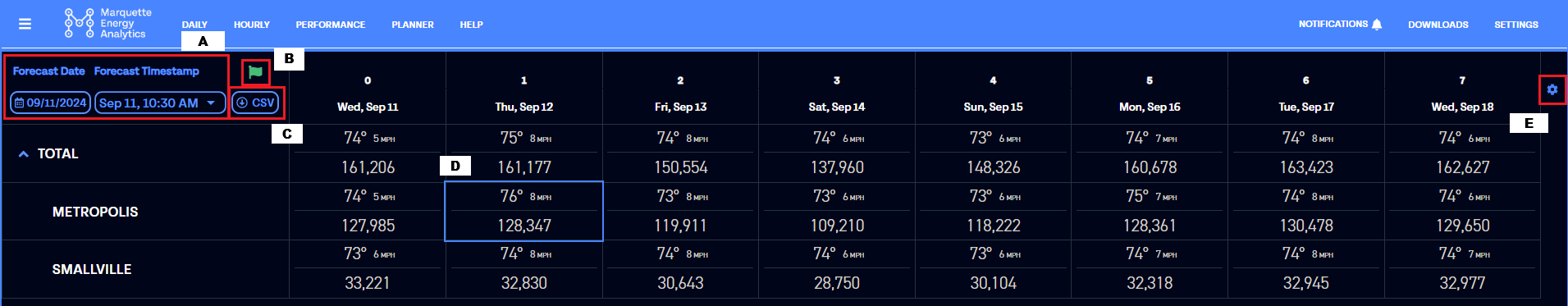
Daily Forecast Selection Boxes (A)
The top left cell of the summary table contains a "Forecast Date" box and a "Forecast Timestamp" box. Using these two boxes, you can navigate to all of your previous forecasts.
Using the forecast date box, you can select the gas day you would like to view. Then you can view the different forecasts generated for that date by selecting the corresponding forecast timestamp.
Daily Pinned Forecast Flag (B)
Next to the forecast selection box, there is a green flag whose shading indicates if the forecast you are viewing is the pinned forecast of that day and intraday period.
If the flag is filled in green, you are currently viewing the pinned forecast. If the flag is just a green outline, you are viewing a forecast that is not the pinned forecast. If you want to change the forecast you are viewing to be the pinned forecast, you can click on the flag icon. This will open a pop-up to confirm that you would like to set the pinned forecast to the current forecast, overwriting any previously pinned forecasts for that date and intraday period.
Note
You must have "User" or "Administrator" privileges to pin a forecast; "Read-Only" accounts cannot pin forecasts.
See also Account Types
See also What are Pinned Forecasts?
Downloading a Forecast CSV (C)
Next to the forecast selection buttons is the button to download a CSV; this will download a CSV of the forecast currently being viewed using the default download mechanism of your browser.
Individual Day Analyses (D)
Each cell of the Summary table gets highlighted when you mouse over it. Clicking a cell will open a series of auto-generated data insights and visualizations, with a table of Similar Days at the bottom.
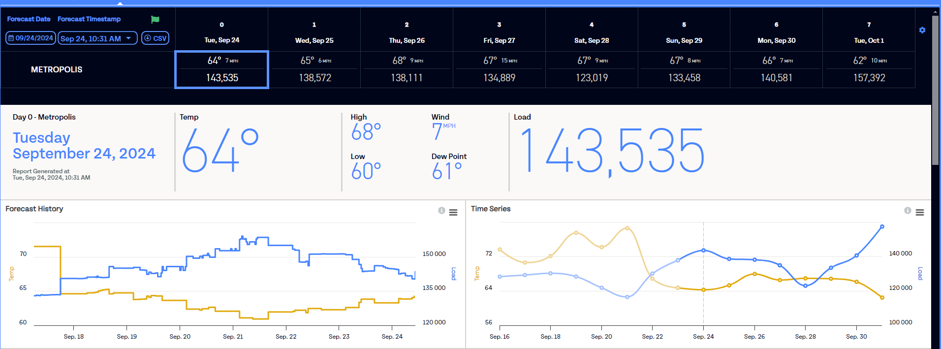
The three bars at the upper right of each chart allow you to download the data used to generate this chart in CSV or XLS format, or to save the chart as an image in PNG, JPEG, SVG, or PDF formats. Mousing over the "i" bubble in each chart will give you a plain text description of the data contained within the chart and what it may mean.
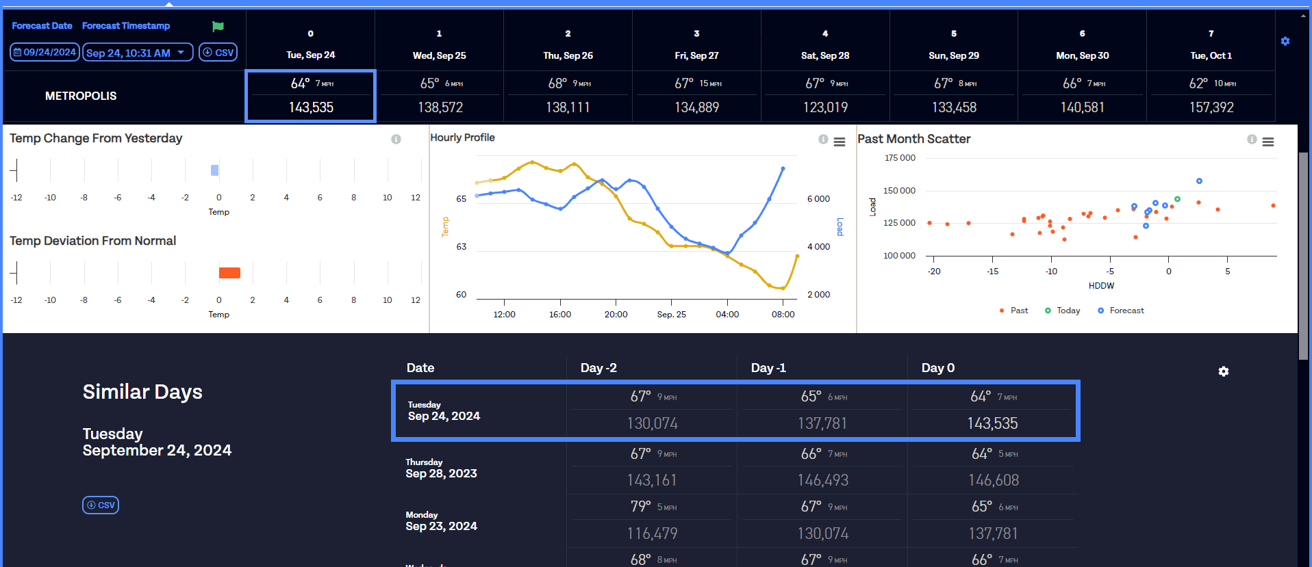
The Similar Days table will display the details of the selected day in the top cell, highlighted in blue, and will display the similar days in the subsequent rows below. The table's data can be downloaded to a CSV using the "CSV" button to the left of the table. Using the settings gear to the right of the table, you can limit the days brought into the similarity comparison to be within a certain amount of degrees or miles per hour of the currently selected day.
Display Settings (E)
The settings cog in the right corner of the Summary table allows you to toggle between different display options for the weather data in the table.
- Whether to show wind values or temperature highs and lows
- Whether to show degrees Fahrenheit, HDDs, or CDDs
- Whether to whole numbers or a single decimal point
Note
Selections in this settings gear are user-specific. Changes made here will not change the default view for other users at your organization.
The Daily Performance Page
The Daily Performance page is available to all users licensing a Daily forecasting product. The page has been developed to provide you with a dashboard containing some of the same tools our data scientists use when they evaluate our forecast models' performance. The main view of the Daily Performance page contains a table with all of your operating areas, and summary stats reflecting each area's model performance over the selected time period, displayed in blue.
When you first navigate to the Daily Performance page from the Daily Navigation dropdown, a splash screen will present you with a tutorial. You can always re-access the tutorial by clicking on HELP in the Nav Bar and selecting "Tutorial".
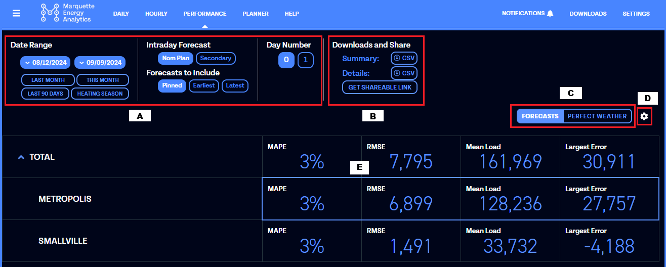
Data Selectors (A)
At the top of the screen, you have a series of data selectors. Using these selectors, you can configure the data being used to perform the model analysis.
- The "Date Range" is the period of time that the performance data is being displayed for. This will only go up until the most recent date for which we have perfect weather forecasts
- The "Intraday Forecast" is the intraday period whose data is being displayed.
- The "Forecasts to Include" is the specific forecast being compared across all days in the date range.
- Because the analysis can only be performed on one forecast per day, one of these options must be selected to compare performance across multiple days. The default is "Pinned" (see also What are Pinned Forecasts?).
- The "Day Number" is the horizon that is being evaluated.
- Daily forecasts typically generate for 8 horizons at a time (horizon 0 - 7). In our experience nearly all analysis is done on just the first two horizons (0 and 1), so those are the only two included on this page.
Downloads and Share (B)
"Downloads and Share" are tools to access the data behind the Daily Performance analysis currently displayed.
- "Summary" will generate a CSV including the summary stats of the data set displayed on the page.
- "Details" will generate a CSV including all of the individual forecast data being analyzed for the data set displayed on the page.
- "Get Shareable Link" will provide a URL to the exact data set being displayed on the page, for easy sharing with other teammates (in order to open this link, the receiver will need to have a verified MCast™ account).
Perfect Weather Toggle (C)
A toggle in the upper right corner allows you to view and hide Perfect Weather summary stats alongside the daily model performance statistics. Perfect Weather statistics will show up in green when this is toggled on.
Any time you click on a row of statistics for an operating area, the Perfect Weather statistics for that area will automatically toggle on to show them alongside the real-time statistics.
See also What is Perfect Weather?
Display Settings (D)
The settings cog in the right corner of the Summary table allows you to toggle between different display options for the weather data in the table.
- Whether to show degrees Fahrenheit, HDDs, or CDDs
- Whether to whole numbers or decimal values
Note
Selections in this settings gear are user-specific. Changes made here will not change the default view for other users at your organization.
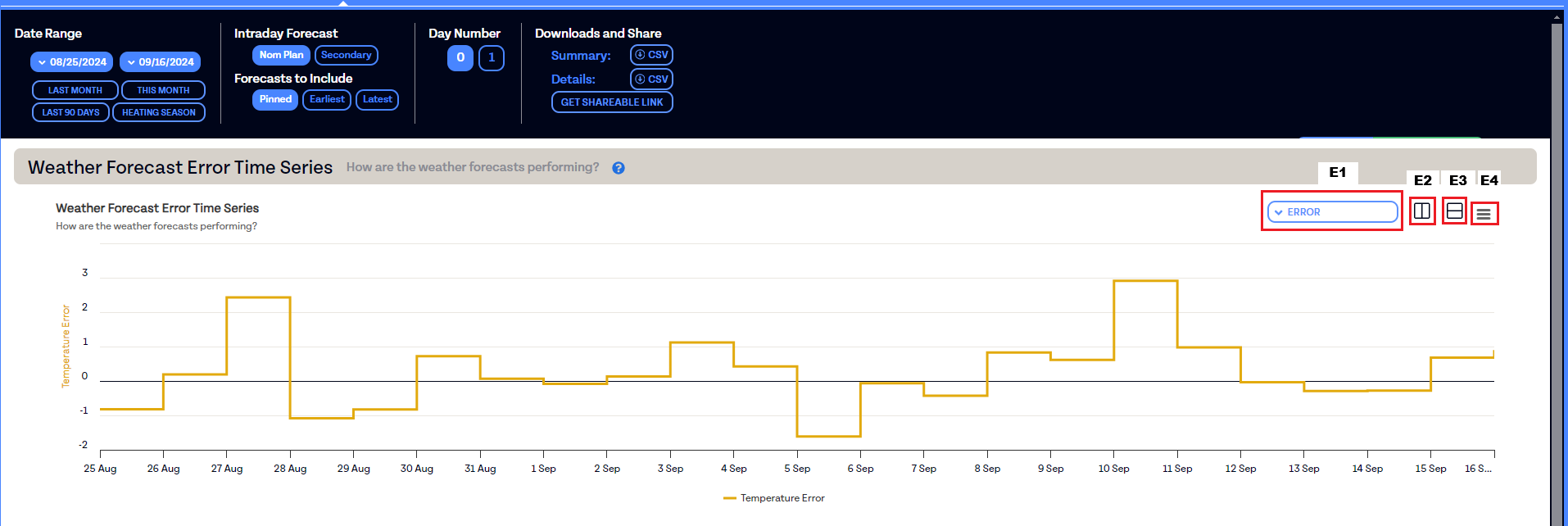
Daily Performance Data Visualizations (E)
Each row of the Performance table displays overview statistics for a given operating area's model performance based on the data selected at the top of the screen. When you mouse over a row, it will highlight in blue. Clicking a row will open a series of auto-generated data visualizations. Each chart will have a title (displayed in large black letters), the basic question our data scientists use the chart to answer (displayed in smaller gray letters), and a clickable blue question mark that will provide a detailed explanation of how our data scientists read the given chart.
In the top right corner of each chart, you'll see
- A dropdown containing data display options (E1)
- A button to compare two charts side by side vertically (E2)
- A button to compare two charts side by side horizontally (E3)
- A dropdown menu of downloadable data and graphics (E4)
The Hourly Page
The Hourly page displays for users who license either of our hourly forecasting products, MCast GasHour or MCast Power. It is designed to display the hourly forecast of a single operating area at a time.

Selecting an Operating Area (A)
Use the left sidebar to view the forecast data for a specific operating area.
Pin Forecast Button (B)
Click this button to pin the selected forecast.
When viewing a pinned forecast, the button appears solid purple and reads "PINNED FORECAST". When viewing an unpinned forecast, it shows a purple outline and reads "PIN FORECAST".
Selecting Specific Forecasts (C)
Use the two dropdown menus at the top for:
- Forecast Date: Choose which day's forecasts you wish to view. The forecast will have been run by MCast on the selected date.
- Forecast Timestamp: Pick the exact time the forecast was generated. (Forecasts are often created multiple times per day)
Day Buttons:
Below the dropdowns, select the specific day within the chosen forecast. This will change the day in the selected forecast being viewed, leaving the forecast generated time the same.
Forecast Summary Metrics (D)
This section shows a summary of key metrics for the selected day.
Current Day compares observed data against the pinned forecast. This data reflects the difference between observed data that's been entered (blue) and expected load based on the pinned forecast (purple). When viewed in real-time, it reflects how close you are to reaching/exceeding the expectation. When viewed on a prior day, it reflects the difference between the observed load and the load expected from the pinned forecast.
Forecast Difference compares the currently selected forecast's load and weather against the pinned forecast's load and weather, highlighting the differences when viewed across the full day.
Peak Load identifies the hour with the highest load for the day, and that hour's corresponding weather value.
30 Days MAPE shows a rolling forecast accuracy over the last thirty days for the selected horizon (Day 0, Day 1, etc.) in two formats - one format reflecting the real-time forecast error (blue) and the other reflecting the Perfect Weather forecast error (green). These metrics are relative to today, regardless of the forecast you're currently viewing. See also What is Perfect Weather?
Note
Note that these metrics rely heavily on the Pinned Forecast feature. See also What are Pinned Forecasts?
Load Time Series Graph (E)
This chart compares the selected hourly load forecast data (dark blue), the pinned forecast (purple), and any observed load data available (light blue).
See also What are Pinned Forecasts?
Weather Time Series Graph (F)
This chart shows the weather forecast used to generate the selected forecast (dark gold), the pinned weather forecast (purple), and any observed weather data available (light gold).
Use the dropdown in the upper-right to switch between different weather data streams.
See also What are Pinned Forecasts?
Display Settings (G)
Use these controls to adjust how data is displayed.
-
Toggle between By Hour (load is relative to the hour) and Cumulative (load aggregates throughout the day) views.
-
Open the settings gear to change temperature units, enable/disable HDD/CDD accumulation, or adjust rounding for weather data.
The Forecast Data Table (H)
This table displays hourly load and temperature values for the selected day. Observed data is in a lighter shade, while forecasted data is in a darker black shade.
The Hourly Performance Page
The Hourly Performance page is available to all users licensing an Hourly forecasting product. The page has been developed to provide you with a dashboard containing some of the same tools our data scientists use when they evaluate our forecast models' performance. The main view of the Hourly Performance page displays summary metrics and chart visualizations reflecting a selected operating area's model performance over the chosen time period.
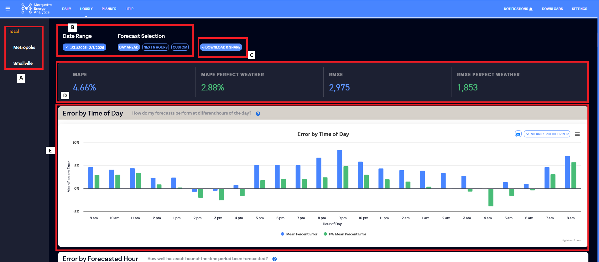
Operating Area Selector (A)
Use the left sidebar to select the operating area whose forecast performance you want to analyze.
Date Range and Forecast Selection (B)
At the top of the screen, use the Date Range picker to set the period of time that the performance data is being displayed for. This will only go up until the most recent date for which we have perfect weather forecasts.
Next to the date range is the Forecast Selection picker. The three preset buttons let you quickly configure which forecasts are included in the analysis:
- DAY AHEAD — analyzes pinned forecasts for hours 24–47 out, made at the gas day start hour. This is the most common selection for day-ahead planning review.
- NEXT 6 HOURS — analyzes all forecasts for hours 0–5 out, made at the gas day start hour. Use this to evaluate near-term intraday performance.
- CUSTOM — opens the Forecast Selection modal for detailed filtering options.
Custom Forecast Selection
Clicking CUSTOM opens the "Forecast Selection for Hourly Performance Data" modal, which gives you granular control over which forecasts are included in the analysis.
Forecasts to Include
Choose one of three options to filter forecasts based on the time-of-day that the forecast was generated:
- PINNED — includes only the pinned forecast for each day. See also What are Pinned Forecasts?
- ALL — includes every forecast generated within the date range.
- FORECASTS MADE BETWEEN — includes only forecasts generated within a specific time-of-day window. Selecting this option enables the time range slider.
Forecasted Hours
These two optional filters let you narrow the analysis to a specific subset of forecasted hours:
-
Hours Out — when checked, this enables a min/max range slider to limit the analysis to forecasts at a specific number of hours out from observed data -- sometimes referred to as specific forecast horizons.
-
Forecasts for times between — when checked, this enables a time range slider to restrict the analysis to forecasts targeting a specific time-of-day window.
Click Save to apply your selections, or Cancel to discard any changes.
Downloads and Share (C)
"Downloads and Share" are tools to access the data behind the Hourly Performance analysis currently displayed.
- "Summary" will generate a CSV containing the four metrics displayed in the Summary Statistics (D)
-
"Details" will generate a CSV including all of the individual forecast data being analyzed for the data set displayed on the page.
Beta Limitation
Weather forecast data is not currently included in the Details file. We plan to add weather columns to this export in a future update.
-
"Get Shareable Link" will provide a URL to the exact data set being displayed on the page, for easy sharing with other teammates (in order to open this link, the recipient will need to have a verified MCast account).
Summary Statistics (D)
Four metric cards at the top of the page summarize forecast accuracy for the selected operating area and time period.
- MAPE (shown in blue) — Mean Absolute Percentage Error, expressed as a percentage. Lower values indicate better forecast accuracy.
- MAPE Perfect Weather (shown in green) — MAPE calculated using Perfect Weather forecasts, representing the portion of error attributable to weather alone.
- RMSE (shown in blue) — Root Mean Square Error in load units (displayed as a whole number). RMSE penalizes larger errors more heavily than MAPE.
- RMSE Perfect Weather (shown in green) — RMSE calculated using Perfect Weather forecasts.
See also What is Perfect Weather?
Hourly Performance Data Visualizations (E)
Below the Summary Statistics, five accordion sections each contain a chart. Click a section header to expand or collapse it. Every chart includes a title, a gray subtitle describing the analytical question it answers, and a blue ? button that explains how our data scientists read the chart.
In the top right corner of each chart, you'll see
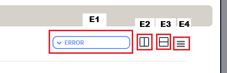
- A dropdown containing data display options (E1)
- A button to compare two charts side by side vertically (E2)
- A button to compare two charts side by side horizontally (E3)
- A dropdown menu of downloadable data and graphics (E4)
The Planner Page
MCast Planner is a medium-term demand forecasting product intended for a variety of supply planning and energy buying use cases. It generates a number of different scenarios for individual months and the full winter based on your historical data.
The primary 12-month load forecast in Planner is generated by running our proprietary forecasting models with a 365-day weather forecast as an input. This year-long weather forecast is provided by our preferred weather vendor, AccuWeather For Business.
A "Normal Weather" forecast for the year is generated by producing a 365-day set of normal weather for a given area and running our load forecasting models with that normal weather data set as the input.
Along with the load forecasts, potential load profiles throughout the coming year are generated under a variety of probability conditions. The "1-in-N" probability conditions and the percent probability conditions are generated by our data science team using a combination of common statistical methods and proprietary methods. They use a large set of historical weather data and an area's detrended load data as inputs to model the various probability scenarios your system may experience.
Weather Inputs for Probability Conditions
All probability conditions are generated using weather data from at least 1973 to the present year. In some cases, we may also include data from 1950-1972.
If you need to know whether the probability conditions in your Planner instance were generated with either 1950 or 1973 as the starting year, reach out to data@marquetteenergyanalytics.com and our team will let you know at their earliest convenience.
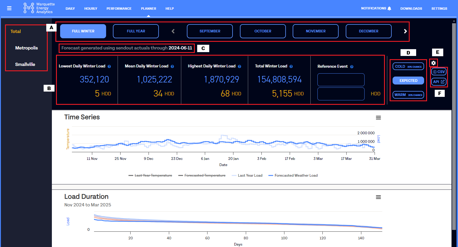
Data Selectors (A)
The Planner dashboard allows a user to view data for a single operating area at a time, over a selected time period.
To toggle between the different operating areas that you license Planner for, use the buttons in the gray panel on the left side of the screen. In the panel, areas that are part of a "total" area will be indented beneath their respective "parent"
Example
In the screenshot above, "Metropolis" and "Smallville" both aggregate into the parent area "Total".
To toggle between different time periods, use the selectors at the top of the screen. You have the following viewing options
- "Full Winter": The forecast for the coming or current November through March (by default). If you wish to modify your winter such that it starts or ends in months other than November and March, reach out to your support contact and we can make that modification for you.
- "Full Year": The forecast for the coming 12 months, starting on the first of the current month and ending on the last day of the prior month (for example, on September 12th of 2024 I will see a "Full Year" displayed from September 1, 2024 through August 31, 2025).
- Individual months: The forecast for a specific month in the coming 12 month period. You can scroll through the diferent months available using the arrows.
Summary Statistics (B)
The dashboard of MCast Planner displays 4 summary statistics in the top half of the screen and two data visualizations in the bottom half of the screen. The summary stats reflect the Planner-generated expectations for the selected Area, Time Period, and Probability Condition.
The three stats on the left (Lowest Daily Load, Mean Daily Load, and Highest Daily Load) reflect the low, mean, and high HDD and load for the individual days within the time period, while the last stat on the right sums the load and HDD's for the entire time period.
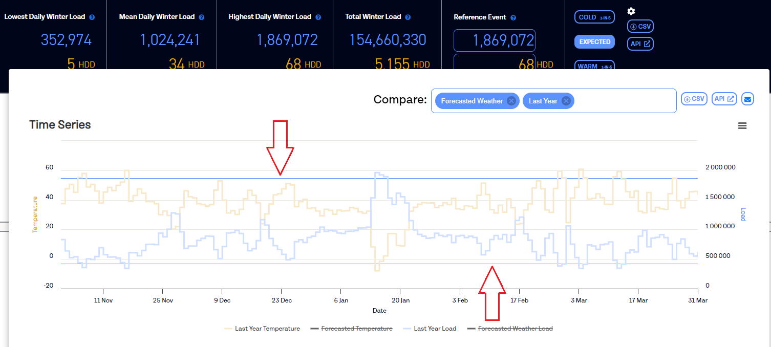
In a fifth block to the right of these stats, you will find a feature labeled "Reference Event." Here you can enter a value for load (in the top box) and/or for HDD (in the bottom box). When entered, these boxes will display horizontal lines that correspond to the values on the Time Series graph and the Load Duration graph when applicable, providing a visual reference to thresholds for load and HDD that you may find valuable.
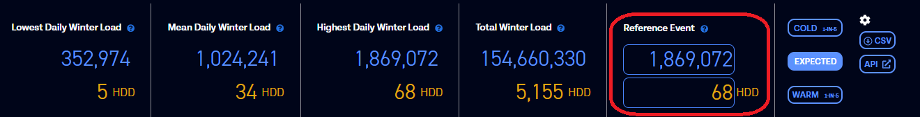
Note
The Reference Event settings are user-specific. If you enter a value in either field, it will show up for you but not for other users in your organization.
"Forecast Generated..." Date (C)
Rather than marking each forecast with the timestamp of when it was created, MCast Planner forecasts are marked with the date of the most recent data used to as an input when forecasts and probability scenarios are generated.
Note that, unlike our short-term load forecasting products, customers do not have the control to generate forecasts for Planner at will. Forecasts for MCast Planner are generated automatically in the background roughly once a week.
Example
In the screenshot above, the forecast there has been generated using load data up through June 11th of 2024.
Cold and Warm Conditions
Cold / Expected / Warm Scenarios (D)
The statistics and visualizations within MCast Planner are configured to toggle between 3 different pre-set scenarios: a "Cold" condition, a "Warm" condition, and an "Expected" scenario.
You can change the probability of the "Warm" and "Cold" scenarios for the time period selected that display across the entire MCast Planner page by selecting the summary gear icon next to the summary table.
These probabilities are reported in terms of percent chance and 1-in-N-years and reflect the probability of the "total load" for the time period.
Example
For instance, if you select "20% chance" or "1 In 5" while the month selected is "February", then "Cold" is a February scenario with a total load that there is a "20% chance" of exceeding, while "Warm" is a February scenario with a total load that there is an "80% chance" of exceeding.
Settings for Cold / Warm Scenarios (E)
Click on the settings gear to the right of the 3 condition buttons to modify the settings for "Warm" and "Cold" conditions. There you'll find the option to select the probability conditions in terms of the "1-in-N" or in terms of a percent probability. Select whichever condition is most useful to you, and the data displayed on the page will adjust accordingly.
Note
Selections in this settings gear are user-specific. Changes made here will not change the default view for other users at your organization.
CSV and API Buttons (F)
These two buttons will show up throughout the Planner user interface. The “CSV” button will allow you to download the data you’re viewing into a CSV format, and the “API” button will open a new tab that details the API calls you can make to grab that same data.
See also Receiving demand forecast results
Planner Visualizations
MCast Planner has 2 built-in visualizations: The Time Series graph and the Load Duration graph. When you click on or mouse-over either graph, it will expand to a larger size with additional buttons and configuration options. To close one of these pop-ups, simply move your cursor outside of the pop-up or click anywhere on the page outside of the pop-up.
The Time Series Graph
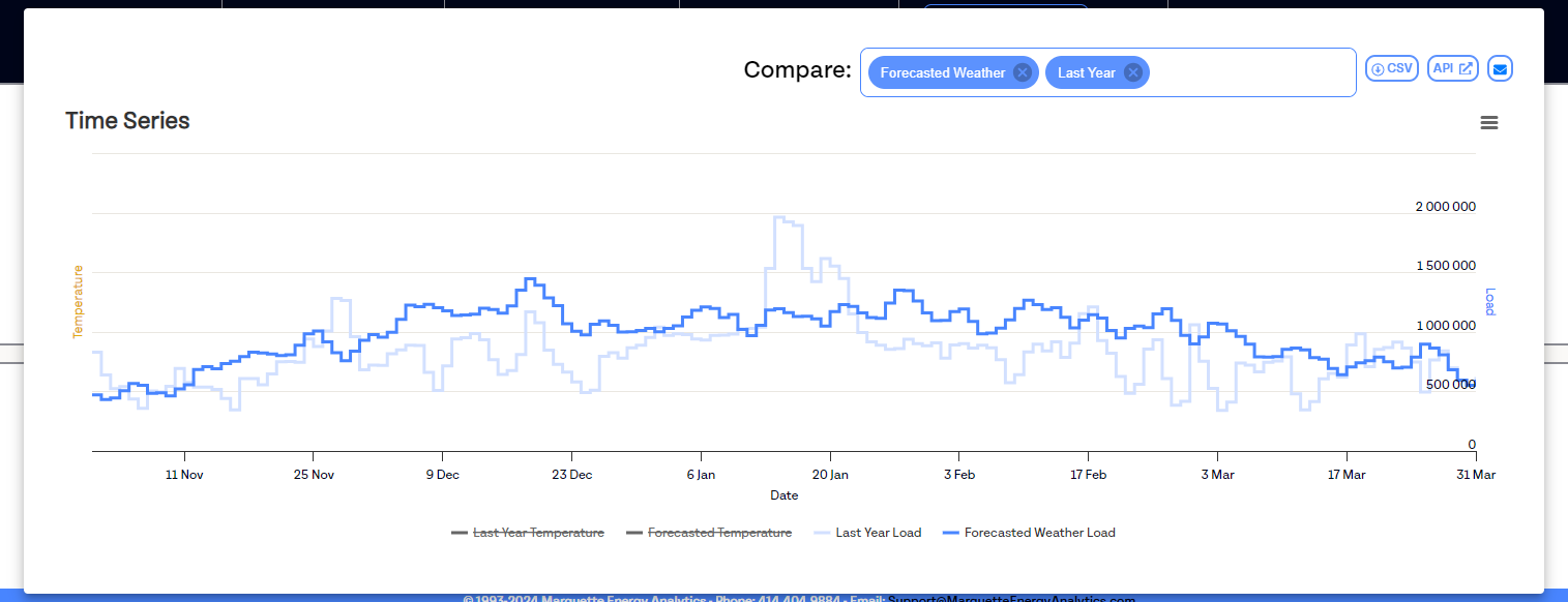
The Time Series plots day-of-year on the X-axis, and both load value and temperature value on the Y-axis. The graph can display the following 3 data streams:
- Forecasted Weather Load: The load forecasts generated using AccuWeather weather forecasts as an input.
- Last Year Load: The observed data points for the prior calendar year.
- Normal Weather Load: The load forecasts generated using the "Normal Weather" as an input.
You can toggle on/off any of the 3 data streams using the "COMPARE" dialog box, visible in the pop-up version of the graph. By default, just the Forecasted Weather Load and Last Year Load are visible at first.
For data streams already enabled by the "COMPARE" box, you can toggle on/off the display of those data streams by clicking on the name of the data stream in the legend. By default, all temperature values are hidden and only the load data is visible at first.
GasDay interacting with Planner
If you license both MCast GasDay and MCast Planner for a given area, then the "Forecasted Weather" Planner forecasts will be supplemented with GasDay forecast data where possible to enhance your short-term forecast data. Wherever the most recent GasDay forecast overlaps with the Planner data you are viewing, the GasDay forecast will be the data displayed.
Example: If the most recent GasDay forecast was generated on April 1st and goes through April 8th, then the "Forecasted Weather" data stream on Planner will have the GasDay forecast from 4/1-4/8 injected into it. Data points for all other data streams and all other dates on Planner will be unaffected by this GasDay data.
The Load Duration Graph
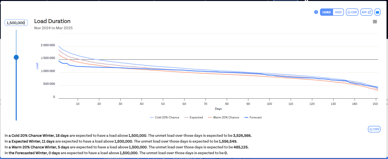
The Load Duration is a distribution plot that organizes the entire data set from the highest day of load data to the lowest day of load data over the selected time period. The X-axis plots the day, while the Y-axis plots the day's load value. In the graph you'll see a number of different data streams plotted out:
- WARM: The "Warm" probability condition, as selected in the settings at the top of the page.
- EXPECTED: The 50% probability condition for the given data set.
- COLD: The "Cold" probability condition, as selected in the settings at the top of the page.
- FORECAST: The load forecasts generated using AccuWeather weather forecasts as an input.
- LAST: The actual data for the selected time period last year (i.e. if the page is set to "Full Winter," then this data stream is displaying actuals from the last winter we have observed data; if the page is set to "February," the this data stream is displaying actuals from the last February we have data for)
You can toggle on/off any of the 5 data streams by clicking on the name of the data stream in the legend. By default the "Last" data stream is disabled, while the other data streams are enabled.
You can draw a "Load Line" when viewing the pop-up version of the graph. Using either the slider or the dialog box on the left side of the graph, you can set a line somewhere on the chart. Once set, you will see the statistics for how many days are expected to have a load above that level, as well as what the total unmet load would be above that level.
You can also toggle the graph between being a "Load Duration" and an "HDD Duration" using the toggle in the upper right. When toggled to "HDD", the distribution plot will then be graphing from the day with the most HDDs to the day with the least HDDs over the selected time period.
Enabling Planner on only some areas
Planner can be enabled or disabled for any area that you license for MCast, even for "total" areas that combine multiple smaller areas.
Note
You cannot enable Planner on any Total areas unless all of that Total area's child areas also have Planner enabled
- Example: If I have an area "Total", which comprises both the areas "Metropolis" and "Smallville," to enable Planner forecasts for "Total" I must have Planner forecasts enabled for both "Metropolis" and "Smallville."